


This One Psychological Principle Will Change Your CTAs!
Edition #36, Application of the Von Restorff Effect to create CTAs

Do you notice how Taylor shows up in a totally different outfit to set herself apart from her backup dancers?

And in general how singers usually stand out from their backup dancers?

Do you know why they do this?
They are following the Von Restorff Effect
The Basics: Von Restorff Effect
aka "isolation effect"Our minds naturally remember things that stand out
The Von Restorff Effect is named after Hedwig von Restorff, the German psychiatrist who discovered it in 1933. She found that when people are presented with a list of similar items, they’re more likely to remember the one that stands out as different.
Basically, if something stands out from its surroundings, it’s more likely to stick in our memory.

So, back to why singers and backup dancers wear different outfits…Singers wear unique outfits to grab attention and stand out, while backup dancers keep it subtle. This contrast helps the singer stand out, making them the main focus of the performance and more memorable to the audience.
And Why does the Von Restorff Effect matter in UI/UX design?
Designers can use this principle to grab users' attention and guide them to take action by making key elements stand out.
When something looks different, like a creative navigation button, users are more likely to remember it and come back later.
Highlighted elements help users quickly find what they need without feeling overwhelmed.
Applying the Von Restorff Effect in UI/UX
The Von Restorff Effect is about making important things stand out in your design.Be strategic about what to highlight.
The more attention for one, the less for the rest.
You shouldn't have too many things/elements competing for attention—it'll confuse and overwhelm users.
Just highlight the important stuff, like:
CTAs
Key products and features
Pricing and subscription options
In this edition, I’ll show how to use the Von Restorff Effect to make your CTA stand out.
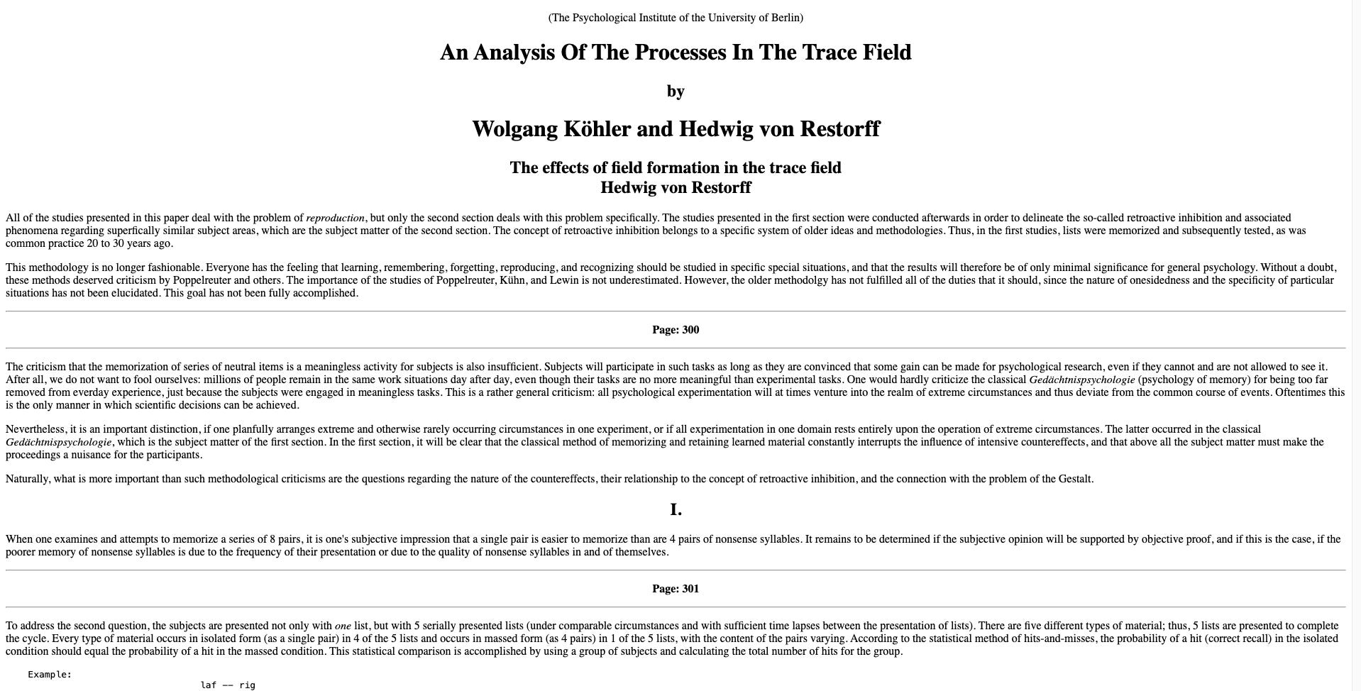
1. Make Your CTA Visually Stand Out
Elements that are visually distinct from their surroundings are more likely to grab attention and be remembered.
Color Contrast: Choose a contrasting color or the primary color for your CTA

Size Variation: Increase the size of your CTA button so it’s at least 20% larger than other buttons or elements.

Typography: Use bold typography for the CTA text to enhance legibility and prominence.
Shape Style: Add a shadow or gradient to make the button appear raised or clickable.

2. Use Motion or Animation
Changes in appearance when interacting with the CTA grab attention and make it stand out.
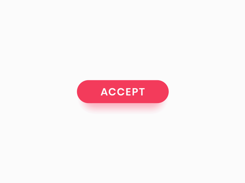
Hover Effects: Implement color change when the user hovers over the CTA (e.g., darkening the button).
Animation: Use micro-interactions like a gentle bounce or glow effect when the CTA comes into view or when the user interacts with it, drawing attention subtly.
Use motion and animations subtly.


Ensure animations are short (1-2 seconds) and non-distracting, so they enhance, rather than disrupt, the user experience.
3. Add Whitespace
Whitespace isolates the CTA, making it more noticeable by eliminating competing distractions.
Buffer Space: Ensure there is at least 20-30 pixels of empty space around your CTA on all sides.
Reduce Clutter: Remove any unnecessary text, images, or buttons that are directly adjacent to the CTA. Keep the surrounding area clean so the CTA is the focal point.

Notice the use of white space and the literal absence of clutter on Apple’s website!

Key Takeaways:
Use contrast in color, size, typography, and shape to make your CTA noticeable and memorable.
Subtle animations or hover effects, like color changes or gentle bounces, draw attention and make the CTA more engaging.
Surround the CTA with at least 20-30 pixels of empty space to isolate it from distractions and ensure it remains the focal point.
If you have any questions about applying the Von Restorff Effect in UI/UX, comment below, and I'll be happy to help!
Edition #37: Application of the Von Restorff Effect (Part 2)
Quote of the Week
“If everything is important, then nothing is”
Patrick Lencioni, American author and management consultant
🌠 Thank you for reading this newsletter.
See you next week,
Irene
Exactly right... Understand your context, and stand out.
It's a corollary to the Visual Hammer effect Laura and Al Ries introduced with respect to positioning: ries.com/visualhammer
super interesting