


Web Design is a Mind Game! Are You Playing to Win?
Edition #37, Substack, HubSpot, and Gmail use these tricks to keep users engaged. Are you?

I think by now, you guys know that I love quizzes. So I will start this one with a quiz too
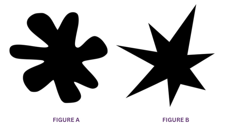
Which one of these shapes do you think is Boba, and which one feels like Kiki?
…
…
…
I figure you said Figure A is Boba and Figure B is Kiki?
Am I right? 😛
This is the magic of the psychology of shapes.
The Basics: Psychology of Shapes
How different shapes affect the way we think, feel, and act.
Shapes speak to us without words, sending emotions and meaning that shape how we see things.
And now, back to that quiz we did! That was actually an experiment first conducted by Wolfgang Kohler way back in 1929, and then later expanded on by V.S. Ramachandran and Edward Hubbard in 2001.

Researchers asked both American college students and Tamil speakers in India, 'Which shape is Bouba, and which is Kiki?' 95-98% of people picked the curvy shape as Bouba and the jagged one as Kiki.

In general, round shapes give off friendly vibes, while sharp ones feel more professional and focused. Here is an example from Disney!

 | Walt Disney Animation Studios Wikia | Fandom")
And why does the psychology of shapes matter in UX?
Shapes influence how we feel. Rounded shapes feel friendly and welcoming, while sharp ones seem professional and efficient.
Simple shapes are easier for our brains to process, making experiences feel faster and smoother.
People also expect certain shapes to be used in familiar ways, so sticking to those patterns helps users feel at ease.
Applying the psychology of shapes in web-design
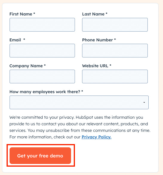
1. Make your buttons/CTAs approachable
By using rounded rectanglesRounded rectangles feel stable but friendly, making them look professional and approachable.

Here’s how to do it:
Add rounded corners (8px to 12px) for a softer look.
Make sure there's enough padding so the button stands out.
Add hover effects, like shadows or slight size changes, to show they’re clickable.
2. Make profile pictures friendlier
By using circlesCircles are friendly and help focus attention on the person, making profile pictures feel more welcoming.

Here’s how to do it:
For square profile pictures, set the
“border-radius”to half of the width or height.
Example: For a 150px by 150px square, set border-radius: 75px.
Alternatively, use a percentage:
Example: Setting border-radius: 50% will also create a circle.
Center-align the image to prevent clipping of important details.
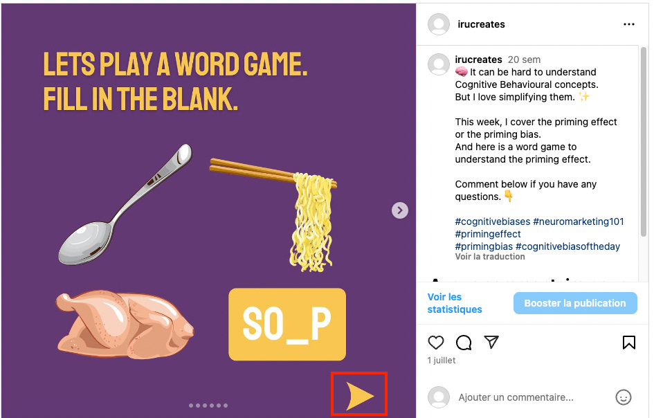
3. Make Navigation easier
By using triangles and arrowsTriangles and arrows are intuitive symbols for direction, signaling movement and guiding users.
Here’s how to do it:
Use down arrows to show menus or dropdowns. A downward arrow signals that a menu or dropdown is available.
Use left/right arrows for sliders or carousels. These directional arrows encourage interaction with content sliders or image
Make sure arrows are big enough to click easily and have enough space around them to avoid mistakes.
Key Takeaways:
Rounded shapes = friendly, approachable, and professional.
Circles = human-centered, intimate, and welcoming.
Triangles & Arrows = directional, guiding, and intuitive.
If you have any questions about applying the psychology of shapes in UI/UX, comment below, and I'll be happy to help!
Quote of the Week
In life you have to avoid three geometric figures - vicious circles, love triangles and square minds
Mario Benedetti, Uruguayan journalist, novelist
🌠 Thank you for reading this newsletter.
See you next week,
Irene
Weird. I guessed Boba was the jagged one, but I guessed it because Boba felt ‘meaner’ to me, so I assumed it would the jagged one. Guess I outsmarted myself haha! Love these quizzes, Irene!
Interesting topic to write about. BTW, there is one riddle. Which 2 things are the most differentiable according to their shapes? (Egg, and Coca Cola bottle) :)