Here’s How to Use Neuromarketing in Pricing Strategy
Edition #45, Learn How Freedom.to Uses Charm Pricing, Scarcity, and More to Win You Over.
Today, Let’s analyze an app’s pricing page to see how it’s using neuromarketing
In 2025, I want to spend less time mindlessly scrolling on my phone and more time actually doing things that matter.
And to help me with this, I subscribed to this app, Freedom.to. And I absolutely love it.
Freedom.to
Freedom.to is an app that blocks distractions like apps or even the internet on your phone.
But honestly, I love their pricing page even more! I was really impressed when making the payment—it’s so smartly designed with neuromarketing in mind.
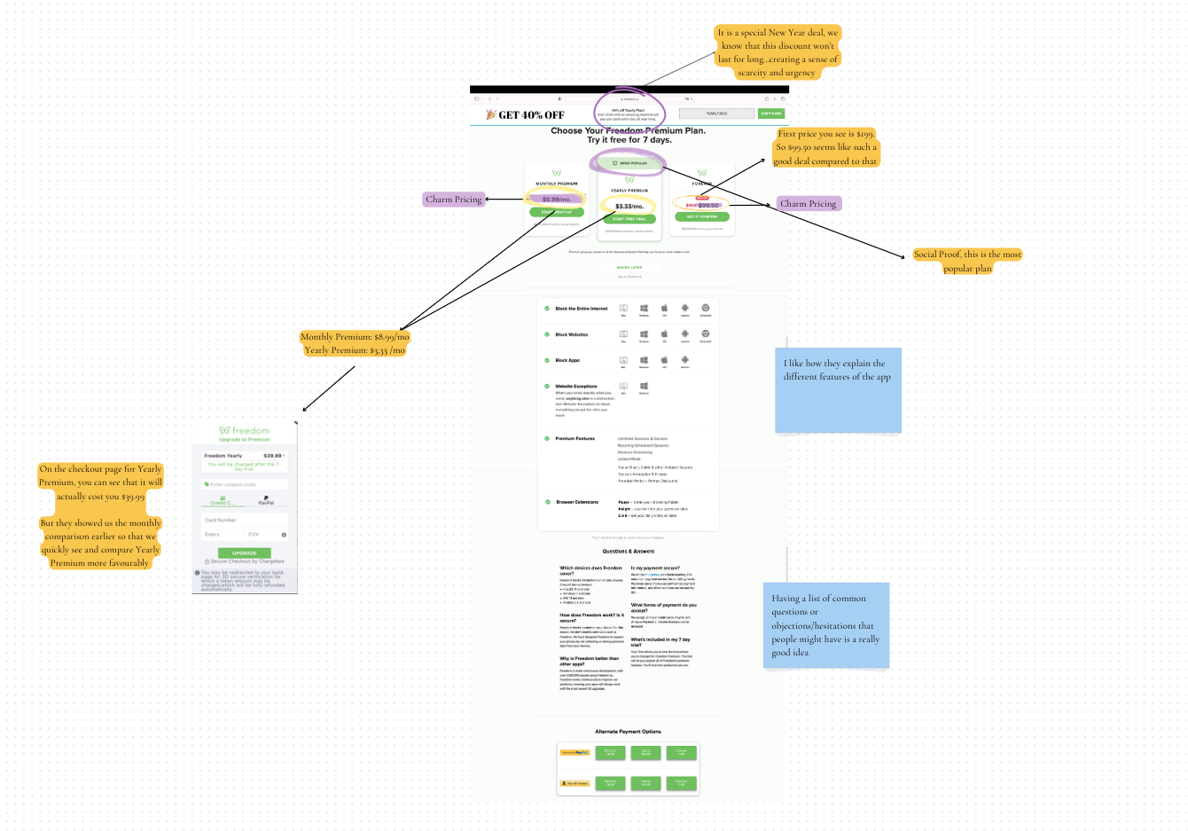
Freedom.to Pricing Page

What Freedom.to does well
1. Charm Pricing
Prices ending in .99 or .95 are perceived as cheaper than rounded prices.That’s because our brains focus on the first number we see. So, the Forever price feels closer to $90 than $100, even though it’s not!
2. Price anchoring
The first price you see affects how you think about a deal. So, when it’s marked down to $99.50, it feels like a bargain because your brain is still comparing it to that higher $199 price.
3. Scarcity
A time restriction or limited availability creates a sense of urgency. 
It makes you feel like you have to act fast.
4. Framing
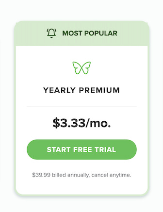
The way information is presented influences decisions.They show the Monthly Premium as $8.99 and the Yearly Premium as $3.33. Now, the Yearly Premium doesn’t actually cost $3.33—it’s $39.99 for the whole year (and yes, they’re using charm pricing here too).
But by breaking it down to $3.33 per month, they make it easier for you to compare it to the $8.99 monthly price and see the Yearly Premium as the better deal. It’s a smart way to frame the choice!
5. Social Proof
We like to follow what others are doing.
What could they improve?
1. Popups
Studies have shown that most users (including me) find popups rather annoying.
Even if they don’t want to get rid of popups completely, they could make them less annoying. For example, they could set it to show only once every 30 days or use cookies to remember if you’ve already seen it. It’s an easy fix
2. Countdown Timer
They could also add a countdown timer for the 40% discount to make it feel urgent, like, "Hurry! Only 3 days, 4 hours, and 13 minutes left!"
3. Value-based pricing
I think they could do a better job showing how much time you’ll save by using this app. It’s clear the app adds a lot of value to people’s lives, but they need to highlight that more!
They could make it super clear how much time users can save.
Block distractions and get back 10+ hours every week!They could add a simple quiz or calculator to show how much time you’d gain based on your habits.
If you block social media for 3 hours a day, you’ll save 90 hours a month!4. Include a Money-Back Guarantee
They could add a "30-Day Money-Back Guarantee" to the premium plans. This would make people feel more confident about their purchases and remove any hesitation.
Disclaimer: Not a sponsored promotion of the app. I am just really excited to be using this app

                              ---

Which of these neuromarketing tricks do you think is most effective? Let me know in the comments!Quote of the Week
Whenever you want to change your behavior, you can simply ask yourself: How can I make it obvious? How can I make it attractive? How can I make it easy? How can I make it satisfying?
James Clear, Author of Atomic Habits
🌠 Thank you for reading this newsletter.
See you next week,
Irene


This is nice breakdown, love it! I was thinking to have deep dive too for best pricing page. Will use it as reference. I like companies who emphasize social proof.
Hi Irene, love your breakdowns, always so interesting. Maybe I missed it, but I didn’t see any type of comparison between amount of time saved by using the app vs cost. For instance, if the app could save 5 hours a month and cost say $5 a month, it’s very easy to see the value. As most of us believe our time is worth more than a dollar an hour!