


Create Beautiful Websites Using this Perfect Proportion
Edition #35, Application of the Golden-Ratio in web design

Which version of the sculpture do you like best?

…
…
…
…
I am guessing it is Figure B - did I get it right?
(And assuming I did, haha) Would you like to know why Figure B might stand out to you?
It’s coz of the Golden ratio
The Basics: The Golden Ratio
The Golden Ratio (equal to 1.618) is a mathematical ratio often considered to be the most pleasing proportion.
symbolized by the Greek letter phi (ϕ)

aka golden number, golden proportion, or the divine proportion
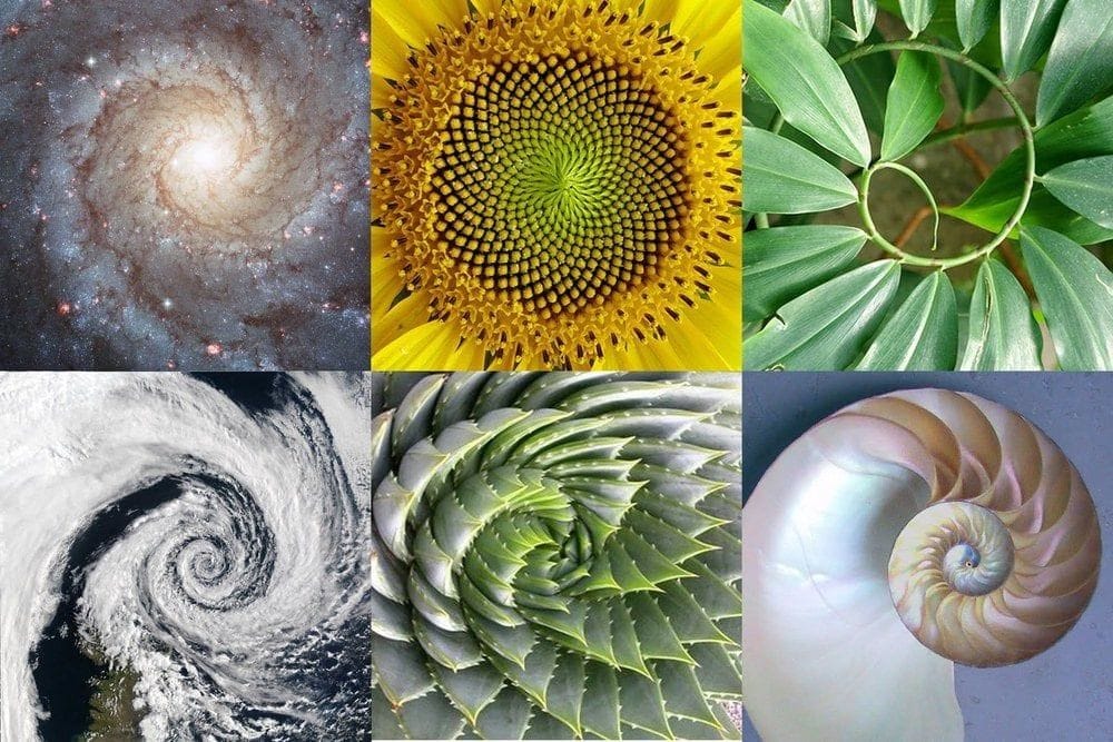
The Golden Ratio shows up everywhere in nature, creating patterns that aren’t just beautiful but super efficient, too:
Seashell curves
Galaxies
Hurricanes
Pine cones
Flower petals
Human body’s proportion
Tree branches
and so many more…
Now, coming back to the example above…
The images are actually of the Doryphoros, a sculpture by Polykleitos


Figure B is the original image of the sculpture. It follows the golden ratio. Figures A and C are distorted versions of the sculpture.
Research by Italian scientists discovered that most people prefer Sculpture B.
When people looked at the original sculptures, their brains showed more activity in areas that handle emotions and sensory experiences, especially in the right insula. This part of the brain helps us process feelings and physical sensations.
The Golden Ratio matters in web design because:
The golden ratio helps space things out evenly, making the design look balanced.
It can also guide users’ eyes to the important parts of the page, making it easier to use.
Since we like things that are well-proportioned, designs using the golden ratio feel more pleasing to look at.
Applying the Golden Ratio in Web Design
1. Guide User Flow
Our eyes naturally follow curved, expanding paths when scanning images or designs
Position the most important content (headline, key images, or primary CTA) near the center of the spiral. The center of the spiral is where the user's attention is naturally drawn first.
As the spiral expands, place secondary elements such as supporting text, product features, or navigation elements along the spiral path.


Hint: You can use plugins in Figma/other software to place the golden spiral on your layout
2. Get the Perfect Font Size
Create a natural rhythm that guides the reader through the content, making it easy to distinguish between different levels of information
Start with a base font size for body text (e.g., 16px for body copy).
Multiply the body font size by 1.618 to determine the size of the next level of headings
16px × 1.618 ≈ 26px for H1 (main header)For subheadings or smaller headings, continue dividing the previous font size by 1.618
26px ÷ 1.618 ≈ 16px for H2Apply this scaling method throughout the design to maintain a consistent hierarchy of typography that feels proportionate and harmonious.

3. Enhance Images with Golden Ratio Cropping
Aligning the spiral’s tightest part with the focal point, ensures that the viewer’s attention is guided instinctively to the most important part of the image.
Decide what part of the image you want to draw attention to (aka the focal point).
Add a golden spiral overlay on the image, with the center of the spiral focusing on the focal point
Crop the image to align the spiral with the focal point.
Adjust if needed.


Word of Caution:

You can definitely end up with a poor design even if you're following the golden ratio.


Design isn’t all about strict math – it’s about how it feels and works for the user.


You don't have to treat The Golden Ratio like a strict rule—just use it as a guide and stick to your intuition.
Key Takeaways:
Place important stuff like headlines or primary CTAs in the center of a Golden Spiral to catch attention immediately.
Start with a comfortable base font size, then multiply by 1.618 for headers for a natural size progression.
Overlay a Golden Spiral on images to place the main focus where the spiral’s center is.
If you have any questions about applying the Golden Ratio in UI/UX, just comment below, and I'll be happy to help!
Quote of the Week
The good, of course, is always beautiful, and the beautiful never lacks proportion.
Plato
🌠 Thank you for reading this newsletter.
See you next week,
Irene
I guessed B! Always good to start Monday off by passing a test haha! Another very informative article, Irene, thank you!
This is very precise. How long did it take you to write it + find information?